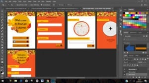
Using colours from my colour palette I created sign in and create account pages, a feature which is common in most app start ups. I kept the pages simple with big, clear sections available to read and write in. I could have fitted all of the sections on one page and just had the audience scroll down to complete the sign up section however I kept the pages minimal so to not confuse or overload the target market and instead use ‘Next’ buttons using skeuomorphic designs highlighting the depth in the flat object to signify the fact that this is a button as ‘Understanding, and accessing, what is clickable can be problematic for some elderly users’ (https://www.w3.org/TR/wai-age-literature/#intro) therefore I want to make this obvious.
The theme which i am revolving my UI kit around is Autumn, the colours which are appropriate for my target market revolve around warm Autumn colours therefore this is featured in the theme of my designs.
Although seniors do not use social media as much as the younger generation they are still a prominent target market ‘Today 46% of online seniors (representing 27% of the total older adult population) use social networking sites such as Facebook,’ (http://www.pewinternet.org/2014/04/03/older-adults-and-technology-use/) which is why I have offered a sign in through Facebook section to appeal to this part of the audience which can use this section.
I have added the option of adding a photograph of the user as this makes the connection with the app and others more personal and make the users feel safer about connecting with other members over the app. I have made this section optional as I do not want to assume that the user obtains digital images of themselves as they may not have any or only physical photographs of themselves, this section can be added later if needed.
Keeping the background colours plain so not to distract the user: ‘Patterned wallpapers may be very attractive or attention-getting, but they provide an additional distraction that can be difficult to ignore. Text placed over even a light or subtly patterned background may prove troublesome, especially for someone with reduced visual acuity.’ I have placed a patterned banner to add some detail to the pages however am thinking about replacing this with a simple Text siting which page they are currently on therefore not distracting the user with useless images and reminding them of the app they are on and the page they are on and why they are on this page.
