Style Guide
Colour:
As humans age our sight and hearing deteriorates, this can cause problems when accessing modern websites and apps as modern design involves many colours of similar shades, this makes it difficult for older people to decipher each colour. As research has shown ‘from the age of 40, contrast sensitivity at higher spatial frequencies starts to decline until at the age of 80 it has been reduced by up to 83%’ (https://www.w3.org/TR/wai-age-literature/#intro). The main three aspects of colour to consider is hue, saturation and lightness; Hue identifies specific colours, colour deficiencies make it difficult to discriminate between colours of similar hue. Saturation measures the colours intensity, the more vibrant the colour appears the more likely it is to be recognized, as vision decreases vibrant colours appear less bright as they appear to younger people. Lightness refers to how much light reflects appears to be reflected from a surface, if you lighten the light colours and darken the dark colours it will increase the visual accessibility. To achieve maximum legibility it is important to show a difference in all three areas to ensure the colour differs dramatically.
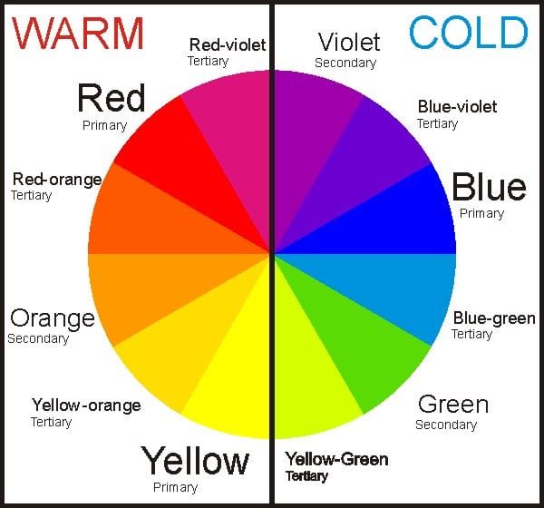
Vision deficiencies may also lead to certain colours becoming imperceptible, it has been found that ‘less violet light is registered by the eye, which makes it easier to see reds, oranges and yellows than it does to see blues, greens and violets’ (http://www.agelight.com/webdocs/designguide.pdf). This makes it difficult for some people to distinguish between green, purples and blues, dark blues also become indistinguishable from black which is important to keep in mind when designing for an older target market.
For my UI kit I am going to concentrate the theme around warm colours which has been found to promote security and harmony; ‘Peach color, warm tans and apricot, terra cota and pink work well with elderly eyes’ (http://www.ehow.com/info_8551183_colors-elderly.html). A key element to remember is to differentiate the colours with high contrasting shades, I want to concentrate on warm colours with high vibrancy, the shades will differ with change in each colour element, I will avoid using cold colours however may implement these on occasion for contrast.
A research group found that ‘When websites violate the guideline to use different colors to clearly distinguish between visited and unvisited links, seniors easily lose track of where they’ve been.’ (https://www.nngroup.com/articles/usability-for-senior-citizens/) This way of implementing colours will be important to know what you have previously clicked on to not aimlessly visit links you have already visited. This colour will have to be vastly different from the original un-clicked link to ensure the visitors can clearly see the difference between clicked and un-clicked links.