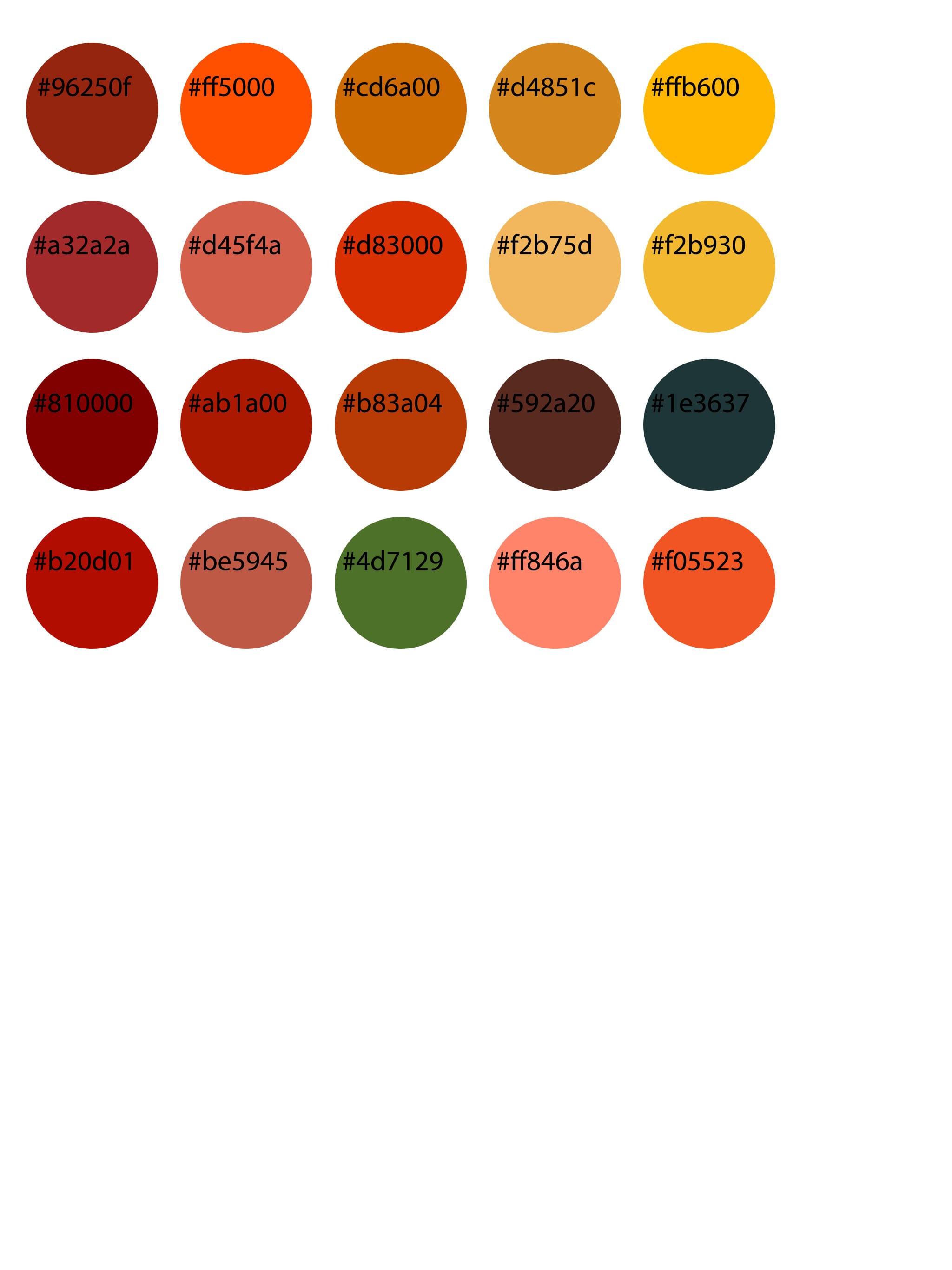
From my research involving what colours appeal to an older generation in terms of what they can comprehend and distinguish better I have created a colour palette of a range of colours I have deemed suitable for my target market. The colours are all of the warm section involving different shades of reds, oranges and yellows as these are high in contrast and are easier for elderly people to see, I have steered away from using shades of purples, blues and greens as these are more difficult to distinguish between. The colours also promote a sense of security and harmony which is valuable for my target market as research has shown that ages over 60 feel more anxious about using technology and often feel like they are going to break it or gain a virus, the colours should therefore give a more relaxing atmosphere to the user experience.